
Infographics
Weather tells stories—and sometimes the best way to tell them is visually. These infographics explore the science, history, and human stories behind memorable weather events, pioneering meteorologists, historic forecasts, climate records, and the evolution of meteorology. Designed to make complex topics engaging and accessible, they combine historical research, meteorological data, maps, photographs, and original illustrations to tell stories that might otherwise remain hidden in archives and old weather logs. Whether highlighting a famous storm, a forgotten weather observer, or the forecast behind a pivotal moment in history, each graphic is designed to make weather history engaging, accurate, and accessible.
Dolly as a Hurricane Name
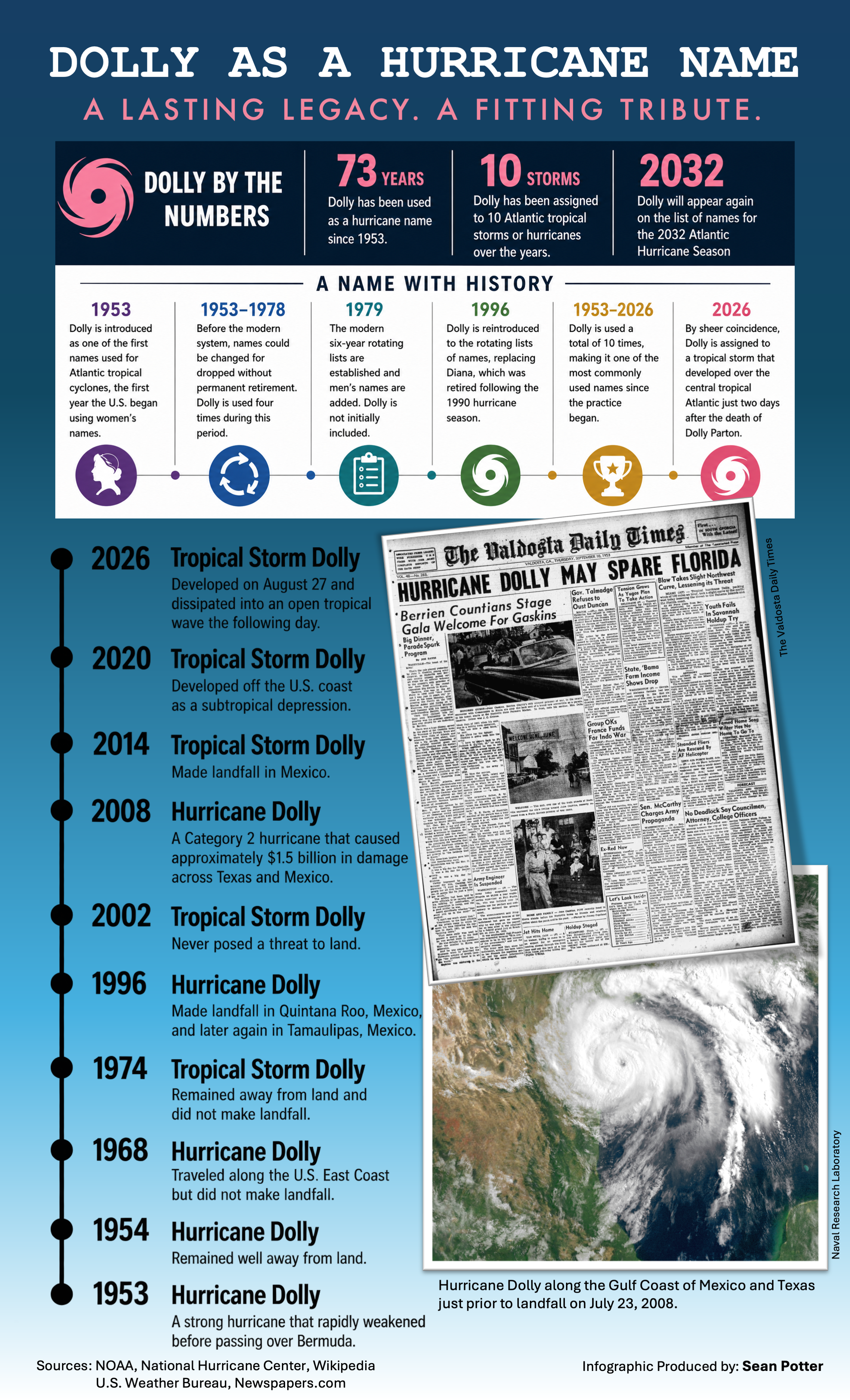
The extraordinary coincidence of Tropical Storm Dolly developing just two days after the death of legendary singer, songwriter, and actress Dolly Parton inspired a deeper look at the history behind the hurricane name. Dolly was among the earliest names assigned to Atlantic tropical cyclones, first appearing in 1953, when Parton was just seven years old. Over the course of 73 years, the name has been assigned to ten Atlantic tropical storms and hurricanes, surviving major changes to the naming system along the way and making it one of the most used names since the practice began. This infographic traces that history from the original Hurricane Dolly of 1953 through the short-lived Tropical Storm Dolly of 2026, which formed over the central tropical Atlantic on August 27 and dissipated the following day.
The timing of the 2026 storm was entirely coincidental: Atlantic hurricane names come from predetermined lists maintained by the World Meteorological Organization, with the modern lists repeating on a six-year cycle. Yet the remarkable convergence of meteorological history and popular culture gives the name new resonance. With Dolly scheduled to return to the Atlantic list in 2032, the name will continue a tropical-cyclone legacy stretching back nearly eight decades—and, in its own small and unexpected way, serve as a lasting reminder of a cultural icon whose own name became known around the world.
Brooklyn Park-Fridley Tornado
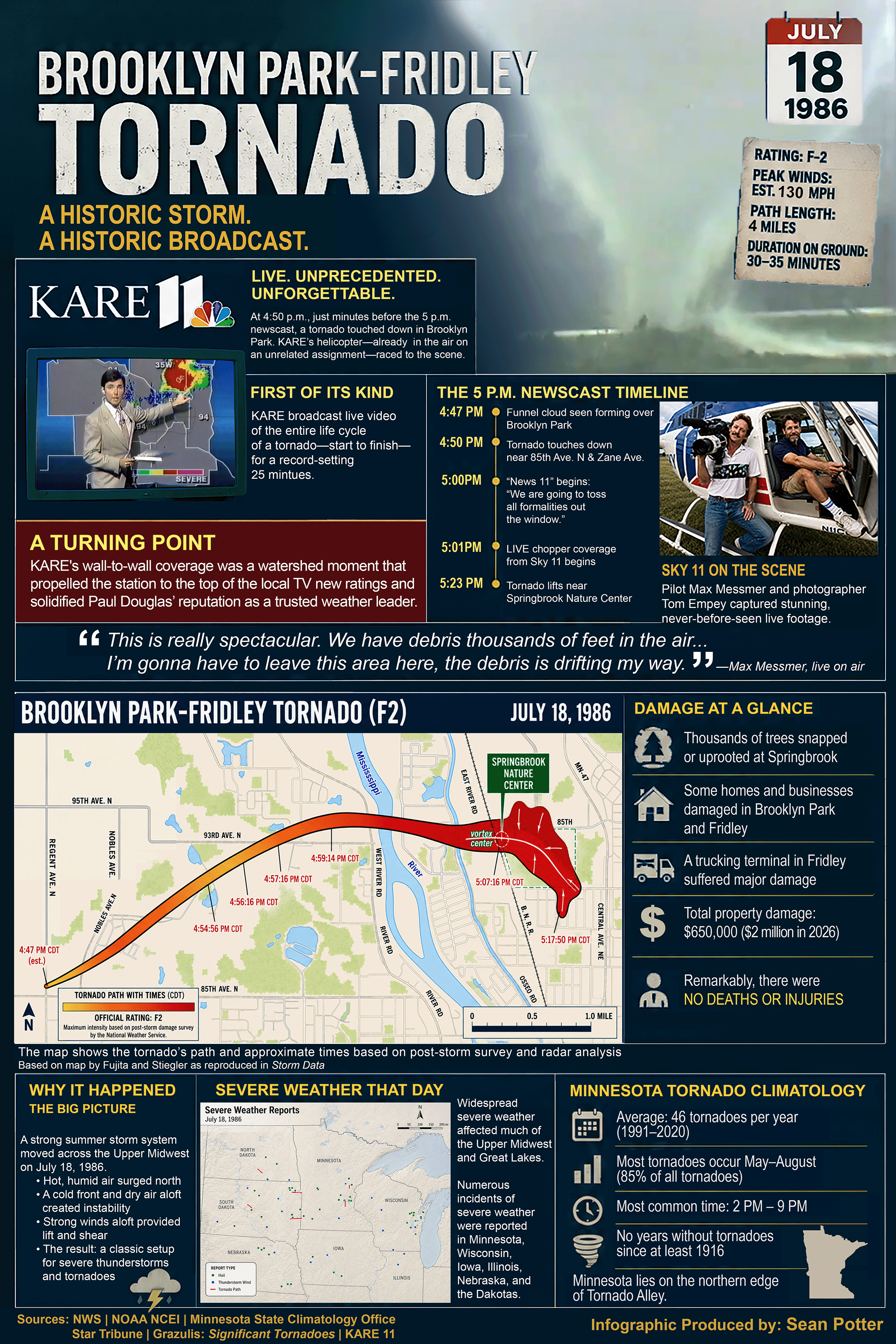
On July 18, 1986, an F2 tornado struck the northern Twin Cities suburbs of Brooklyn Park and Fridley, Minnesota, producing one of the most remarkable weather broadcasts in television history. This infographic traces the storm from touchdown to dissipation, highlighting KARE 11 meteorologist Paul Douglas and the station's unprecedented live helicopter coverage of the tornado's entire life cycle—a first in U.S. television. It features a detailed timeline of key events, an annotated map showing the tornado's path and approximate times, photographs of the Sky 11 crew, and a summary of the damage despite the absence of any deaths or injuries. Additional panels explain the meteorological conditions that produced the storm, place it within the broader severe weather outbreak affecting the Upper Midwest, and provide context on Minnesota's tornado climatology. Together, these elements illustrate both a memorable meteorological event and a pivotal moment in broadcast weather journalism that helped elevate Douglas and KARE 11 to national prominence.
July 4 Temperatures in our Nation’s Capital
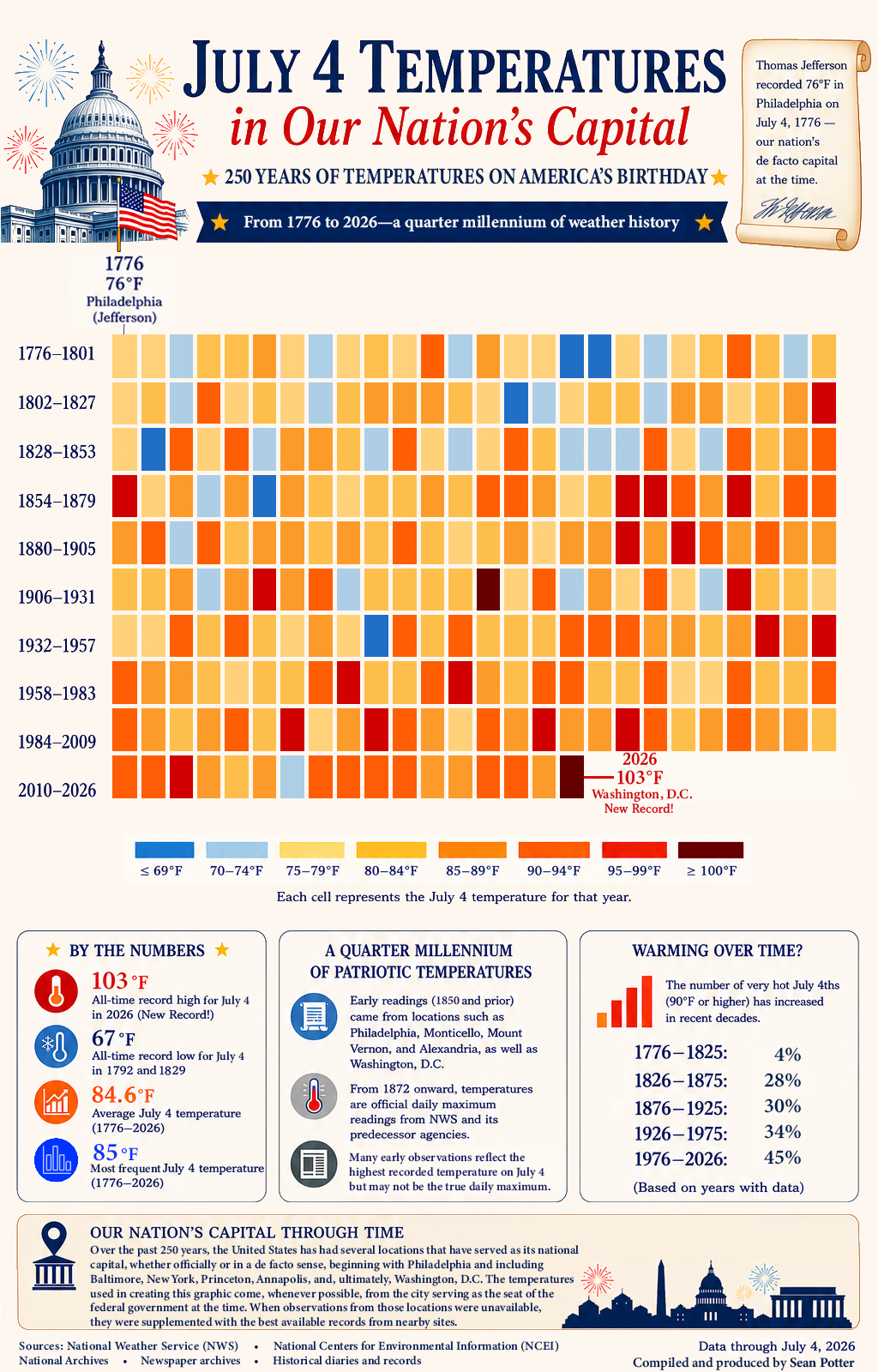
Most people are familiar with Thomas Jefferson’s famous observation of 76°F in Philadelphia on July 4, 1776, and many also know that Washington, D.C., reached a record 103°F on July 4, 2026. But what about all the years in between? This infographic answers that question by compiling July 4 temperature observations from historical and official sources, including the National Weather Service (NWS), National Archives, National Centers for Environmental Information (NCEI), newspaper archives, historical diaries, and other contemporary records. Because Washington did not become the nation’s permanent capital until 1800—and systematic observations there began decades later—the earliest temperatures come from the locations serving as the seat of the federal government at the time or nearby sites with the best available observations. From 1872 onward, all temperatures are official daily maximum observations for Washington, D.C., from NWS and its predecessor agencies, placing this year’s record heat into a broader historical perspective.
The Weather on July 4, 1776
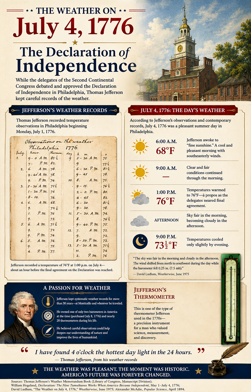
This infographic explores the weather in Philadelphia on July 4, 1776, the day the Second Continental Congress adopted the Declaration of Independence. Drawing on Thomas Jefferson's original weather memorandum book, it reconstructs the day's conditions through the temperatures and observations he recorded while serving in Congress. The infographic features Jefferson's handwritten weather log, one of his surviving thermometers, and a timeline of conditions from sunrise through evening, showing that the day began with pleasant sunshine before becoming cloudier later in the afternoon. It also highlights Jefferson's lifelong dedication to meteorological observation and scientific instrumentation, placing his July 4 records within the broader history of American weather observing. Together, these rare historical artifacts and contemporary accounts provide a unique glimpse at the atmospheric backdrop to one of the most consequential days in American history.
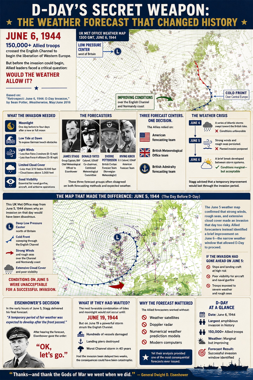
D-Day’s Secret Weapon
The fate of D-Day—and perhaps the course of World War II—hinged on more than military strategy. It depended on the weather. This infographic tells the story of the remarkable forecast that enabled the Allied invasion of Normandy on June 6, 1944. Featuring original UK Met Office weather maps from June 5 and June 6, it explains why the invasion was postponed, how meteorologists identified a brief period of improving conditions, and why General Dwight D. Eisenhower ultimately gave the order to proceed. It also introduces the key forecasters behind the decision, outlines the precise weather conditions required for Operation Overlord, and examines the devastating storm that struck the English Channel less than two weeks later—underscoring just how narrow the opportunity for success truly was.
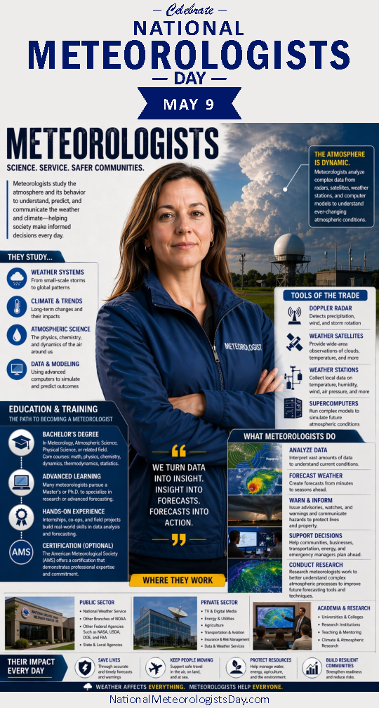
National Meteorologists Day—Meteorologists
Created in recognition of National Meteorologists Day, this infographic celebrates the science, skill, and public service of the professionals who study Earth’s atmosphere to better understand and predict weather and climate. Centered around a photorealistic meteorologist, the design uses annotated visuals, icons, and callout panels to explain the educational background, technical expertise, and advanced tools—including Doppler radar, satellites, weather stations, and supercomputers—that support modern forecasting. It also highlights the many roles meteorologists play in analyzing data, producing forecasts, conducting research, communicating hazards, and improving forecasting techniques. Additional sections showcase career opportunities across government agencies, private industry, and academia while emphasizing the profession’s broad societal impact. From protecting lives and property to supporting transportation, agriculture, energy, and emergency management, meteorologists transform complex atmospheric data into actionable information that helps communities make safer, more informed decisions every day.